Key takeaways
- AI search visibility data from platforms like Promptwatch can be exported to Looker Studio via API or CSV, then visualized as heatmaps and trend charts for competitive analysis
- Heatmaps in Looker Studio work best for comparing competitor mention rates across multiple AI models (ChatGPT, Perplexity, Gemini, etc.) at a glance
- Time series charts reveal momentum shifts — a competitor's sudden visibility spike often signals new content or a citation win worth investigating
- The most useful dashboards combine at least three views: a share-of-voice scorecard, a model-by-model heatmap, and a weekly trend line per competitor
- Getting the data right matters more than the chart type — garbage in, garbage out applies here just as much as in traditional SEO reporting
AI search is eating into traditional organic traffic, and the brands winning in ChatGPT, Perplexity, and Google AI Overviews aren't necessarily the ones with the best SEO. They're the ones being cited. If you want to understand how your competitors are performing across AI engines — and spot the gaps before they widen — you need a dashboard that makes the data readable at a glance.
Looker Studio is a solid choice for this. It's free, connects to a wide range of data sources, and gives you enough flexibility to build something genuinely useful rather than just pretty. This guide walks through exactly how to do it.
Understanding the data you're working with
Before touching Looker Studio, you need to know what data you're actually trying to visualize. AI search visibility data is different from traditional rank tracking. You're not measuring a position number from 1 to 100. You're measuring things like:
- Mention rate: How often does a brand appear in AI responses to a given set of prompts?
- Citation share: Of all the sources cited in AI answers, what percentage point to your competitor vs. you?
- Model-level visibility: Is a competitor strong in Perplexity but weak in ChatGPT? That's a strategic insight.
- Prompt-level data: Which specific questions is a competitor being recommended for that you're not?
This data typically comes from a dedicated AI visibility platform. Promptwatch exports this data via API and Looker Studio integration, which makes it a natural fit for the workflow described here. Other tools in this space vary in what they export.
The key fields you'll want for a competitor dashboard are:
- Date (for trend charts)
- Brand/competitor name (dimension)
- AI model (ChatGPT, Perplexity, Gemini, Claude, etc.)
- Prompt or topic category
- Mention rate or visibility score (metric)
- Citation count (metric)
If your data source doesn't have all of these, you can still build useful charts — you'll just have fewer dimensions to slice by.
Setting up your data source in Looker Studio
Option 1: CSV upload via Google Sheets
The simplest path. Export your AI visibility data from your tracking platform, paste it into Google Sheets, and connect that sheet to Looker Studio as a data source.
In Looker Studio: click "Add data" > "Google Sheets" > select your sheet. Make sure your date column is formatted as YYYY-MM-DD or Looker Studio will treat it as a string rather than a date field, which breaks time series charts.
One practical tip: use a separate tab in your Google Sheet for each competitor, then use a UNION connector in Looker Studio to combine them. This keeps your raw data clean and makes it easier to add a new competitor later without restructuring everything.
Option 2: API connection
If your AI visibility platform has a Looker Studio connector or a REST API, this is the better long-term option. Data refreshes automatically, you don't have to remember to re-export, and you can set up scheduled email reports.
Promptwatch has a Looker Studio integration built in, which handles the connection without needing to write any code. For platforms without a native connector, you can use a middleware tool like Zapier to push data into BigQuery, then connect BigQuery to Looker Studio.
Option 3: BigQuery for larger datasets
If you're tracking 10+ competitors across 200+ prompts over 12 months, a Google Sheet will start to feel slow. BigQuery handles this volume easily, and Looker Studio's BigQuery connector is fast. The setup is more involved, but for agency-scale reporting it's worth it.
Building the heatmap: competitor visibility by AI model
The heatmap is the most useful single chart for competitive AI search analysis. It answers the question: "Who is winning where?"
What the heatmap should show
Rows: competitors (including your own brand) Columns: AI models (ChatGPT, Perplexity, Gemini, Claude, Grok, etc.) Cell values: mention rate or visibility score Color scale: green = high visibility, red = low
At a glance, you can see if a competitor dominates Perplexity but is invisible on Claude, or if your brand has a specific model gap to close.
How to build it in Looker Studio
Looker Studio doesn't have a native "heatmap" chart type in the way Tableau does, but you can replicate it using a pivot table with conditional formatting.
- Add a chart > select "Pivot table with heatmap"
- Set the row dimension to "Brand" (your competitor names)
- Set the column dimension to "AI Model"
- Set the metric to "Mention Rate" or "Visibility Score"
- Under "Style", enable "Show heatmap" — this colors cells based on value
The result looks like a proper heatmap. You can adjust the color scale under Style settings. I'd recommend using a diverging scale anchored at your own brand's score, so you can immediately see where competitors are outperforming you.
One thing to watch: if your data has many null values (a competitor wasn't tracked for a particular model in a given period), Looker Studio will show those cells as blank. Add a calculated field that replaces nulls with 0 to keep the visual clean.
Building trend charts: visibility over time
The heatmap tells you the current state. Trend charts tell you the story of how you got here — and where things are heading.
The basic time series
In Looker Studio, add a "Time series" chart:
- Dimension: Date
- Breakdown dimension: Brand (this creates one line per competitor)
- Metric: Mention Rate or Visibility Score
Set the date range to at least 90 days. Shorter windows hide the signal in the noise. If you have 6 months of data, use it.
The breakdown dimension is what makes this chart useful. Without it, you get a single aggregate line. With it, you get one colored line per competitor, so you can see who's trending up and who's plateauing.
Spotting momentum shifts
The most actionable thing a trend chart can show you is a sudden inflection point — a competitor's visibility jumping 20% in two weeks. That almost always means one of three things:
- They published new content that AI models started citing
- They got featured in a high-authority source that AI models reference
- A competitor you were ahead of just ran a GEO optimization campaign
When you see a spike like this, the next step is to look at which prompts drove the change. That's where prompt-level tracking from your AI visibility platform becomes essential.
Adding a 7-day moving average
Raw weekly data can be spiky. A moving average smooths it out and makes trends easier to read. In Looker Studio, you can add a moving average trendline under Chart > Style > Trendlines. Set it to 7 days (or 4 weeks if you're working with weekly data).
Cumulative trend chart
For executive reporting, a cumulative visibility chart is useful. It shows total citations or mentions accumulated over time per competitor. This makes it obvious when one brand is pulling ahead in absolute terms, even if the week-over-week rate looks similar.
To build this, you'll need a calculated field. In Looker Studio, create a running sum using a custom formula or pre-aggregate the cumulative values in your data source before importing.
Adding context: scorecards and share-of-voice
Trend lines and heatmaps are more meaningful with a few scorecards at the top of the dashboard. These give the reader an immediate sense of scale before they dig into the charts.
Useful scorecards for a competitor AI visibility dashboard:
- Your current visibility score (with comparison to previous period)
- Competitor with highest visibility score this week
- Number of prompts where you appear but competitors don't (your exclusive wins)
- Number of prompts where competitors appear but you don't (your gap count)
The gap count scorecard is particularly useful. It's a direct measure of opportunity — and it tends to motivate action in a way that abstract visibility scores don't.
For share-of-voice, a stacked bar chart works well. Each bar represents a prompt category (e.g., "best project management tools", "CRM software for small business"), and the segments show what percentage of AI mentions each brand captures within that category.
Filtering and interactivity
A static dashboard is useful. An interactive one is better.
Date range filter
Add a date range control at the top of the dashboard. This lets anyone viewing the report adjust the time window without needing to edit the underlying charts. Set the default to "Last 30 days" for most use cases.
Competitor filter
Add a filter control linked to your "Brand" dimension. This lets you isolate a single competitor's performance across all charts simultaneously. Useful when you're doing a deep-dive on one specific rival.
AI model filter
If you're tracking 8-10 AI models, the heatmap can get wide. A model filter lets viewers focus on the models most relevant to their audience — for example, a B2B brand might care more about Perplexity and Claude than about Grok.
To add filters in Looker Studio: Insert > Filter control > select the dimension you want to filter by. Make sure to set the filter to apply to all charts on the page, not just the one you added it to.
Prompt-level drill-down page
The overview page shows you the "what." A second dashboard page can show you the "why."
Build a table on page 2 that lists individual prompts in rows, with columns for:
- Prompt text
- Your mention rate
- Top competitor mention rate
- Gap (calculated field: competitor rate minus your rate)
- AI models where gap is largest
Sort by the Gap column descending. The top rows are your highest-priority content opportunities — the specific questions where a competitor is being recommended and you're not.
This is where the dashboard becomes genuinely actionable rather than just informational. A tool like Promptwatch calls this "Answer Gap Analysis" and surfaces exactly this view natively, but replicating the core logic in Looker Studio is doable if you have the underlying prompt-level data exported.
Comparison table: AI visibility tools and Looker Studio compatibility
| Tool | Looker Studio export | API access | Prompt-level data | Competitor tracking |
|---|---|---|---|---|
| Promptwatch | Native integration | Yes | Yes | Yes |
| Otterly.AI | CSV only | Limited | Basic | Yes |
| Peec AI | CSV only | No | Limited | Yes |
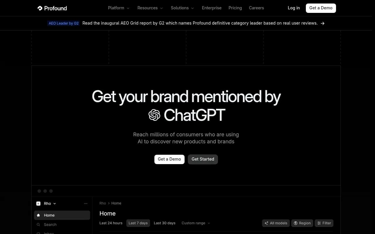
| Profound | CSV/API | Yes | Yes | Yes |
| AthenaHQ | CSV | Limited | Yes | Yes |
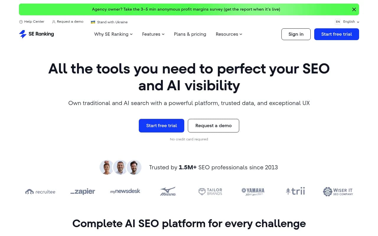
| SE Ranking | Native connector | Yes | No | Limited |
Otterly.AI

Profound

The native Looker Studio integration matters more than it sounds. With CSV exports, you're manually refreshing data. With a native connector or API, the dashboard updates automatically and you can set up scheduled email delivery to stakeholders.
Practical tips that save time
A few things that aren't obvious until you've built a few of these dashboards:
Normalize your competitor names early. If your data source has "ChatGPT" in some rows and "OpenAI" in others, your heatmap will show them as separate entities. Clean this up in your data source before connecting to Looker Studio, not after.
Use blended data sources carefully. Looker Studio lets you blend multiple data sources in a single chart. This is powerful for combining AI visibility data with Google Analytics traffic data, but blends can be slow and sometimes produce unexpected results. Test blended charts with a small date range first.
Page-level performance matters. If you're tracking which specific pages on your site (or competitors' sites) are being cited by AI models, add a URL dimension to your data. A table showing "top cited pages per competitor" is one of the most useful views you can build — it tells you exactly what content is working for them.
Don't over-chart. The temptation is to add every metric you have. Resist it. A dashboard with 4 well-chosen charts that tell a clear story is more useful than 12 charts that require 20 minutes to interpret. Start with the heatmap, one trend chart, and two scorecards. Add more only when someone asks for it.
Sharing and scheduling
Once your dashboard is built, Looker Studio makes sharing straightforward. You can share a view-only link, embed the dashboard in a Notion page or internal wiki, or set up scheduled email delivery (File > Schedule email delivery) to send a PDF snapshot to stakeholders every Monday morning.
For agency use, consider creating a template report and using Looker Studio's "Make a copy" feature to duplicate it for each client. Swap the data source on the copy, and the chart structure carries over automatically.
Putting it all together
The goal of this dashboard isn't to produce a beautiful report — it's to answer a specific question fast: "Where are my competitors gaining AI visibility that I'm not, and how quickly is that gap changing?"
The heatmap answers the first part. The trend chart answers the second. The prompt-level drill-down tells you what to do about it.
If you're starting from scratch, build the heatmap first. It takes about 30 minutes with clean data, and it will immediately show you something you didn't know before. That's the test of whether a dashboard is worth maintaining.