Key takeaways
- Most GEO tools are hard to use because they answer "were we mentioned?" and leave the "so what do I do?" part to you.
- Tools disagree with each other on the same brand, and a single "visibility score" hides how crowded an AI answer really is.
- AI platforms change behavior overnight, so static dashboards without change detection go stale fast.
- Good design connects four things in one place: measurement, diagnosis, action, and verification.
- Before buying, run a one-week trial against a real task, not a feature checklist.
The feeling is not in your head
If you have opened a GEO dashboard in the past year and thought "okay, but what am I supposed to do now?", you are not slow. The tools are often built that way.
A lot of the category grew out of a simple idea: send a list of prompts to ChatGPT, Perplexity and Gemini, check whether your brand shows up, and draw a line chart. That is easy to build. It is also not very useful on its own. The chart goes up or down, and nothing tells you why.
This guide looks at where the usability problems actually come from and what better design looks like. It is opinionated, because the category deserves some opinions. Most of the pain falls into five buckets.
Problem 1: one score that explains nothing
The most common design choice in GEO tooling is a single headline number. "Visibility: 42." Maybe with a green arrow.
The trouble is what a single number hides. Promptwatch's data on unique domains per response (Sep 28 to Oct 4, 2026) found that 47.6% of ChatGPT responses with citations cite 10 or more different domains, and for organic prompts with no brand named, that rises to 52.5%. In other words, you are almost never alone in an answer. A tool that only reports "cited: yes" tells you nothing about whether you are one of 3 sources or one of 14.
A usable tool breaks the score apart so you can see which problem you have:
- Low share of voice usually means a coverage problem. You are not in enough answers.
- Late position in the answer is a prominence problem.
- Mentions without citations to your own pages point to content or crawlability trouble.
- Weak sentiment is a reputation problem.
If a dashboard cannot help you tell these apart, it is a scoreboard, not a tool.
Problem 2: tools disagree, and nobody explains why
Genezio's co-founder wrote in April 2026 that when he ran the same brand through several platforms side by side, the results barely overlapped. That is a vendor making a point about its own product, so treat it with some salt. But anyone who has trialed two trackers at once has seen the same thing.
There are a few honest reasons for the disagreement:
- Some tools query model APIs. Others monitor the real user interface. Answers, citations and shopping results can differ between the two.
- Prompt sets differ, and a prompt set of 50 is a small sample of an unstable system.
- Country, language and persona settings change the answer.
- Different tools count a "mention" differently (brand aliases, competitor merging, sentiment rules).
Good design makes these choices visible. You should be able to see which surface was queried, from which country, in which language, with which brand aliases, and what counted as a mention. When a tool hides that, the number feels arbitrary, and people stop trusting it.
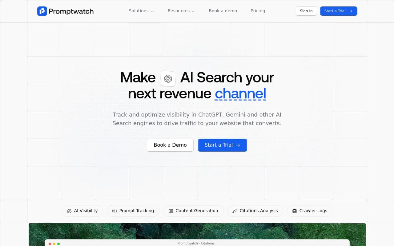
This is why the real-UI versus API question matters in practice. Promptwatch monitors the actual interfaces of ChatGPT, Google AI Overviews, Google AI Mode, Gemini, Perplexity and others per country and language, and tracks API models alongside to show what models believe from training data. Whichever tool you pick, ask this question before anything else.
Problem 3: static dashboards in a moving system
AI search is not stable. Three examples from Promptwatch Data in 2026:
- On August 8, 2026, ChatGPT started using the site: operator at scale. Site-scoped fanout queries jumped from about 0.4% to about 17% of all fanout queries in one day, and average searches per response nearly doubled.
- On August 14, 2026, reddit.com's share of ChatGPT citations fell from roughly 4% to 0.5%.
- Around the GPT-5.3 rollout on March 4, 2026, average citations per ChatGPT response dropped across several models.
Now imagine a dashboard that shows a line dropping on August 14 and says nothing. You would spend a week wondering what you did wrong. The answer was "nothing, the platform changed."
Good design treats platform change as a first-class object. That means annotations on charts for known model or behavior shifts, the ability to compare two time periods side by side, and alerts when something moves outside normal range. A one-off audit is a snapshot. You need something closer to a seismograph.
Content decays too. Promptwatch's half-life study found that pages ChatGPT cited on July 6, 2026 stayed cited at very different rates by type: landing pages and docs lasted longest, and news lost half its pages within 36 days. A tool that shows "cited last week" without showing how citation lifespans behave leaves you to guess what to refresh.
Problem 4: the tool stops at the dashboard
The Frase guide in the research makes a point I agree with, even though it comes from a vendor with a stake: GEO is work you do, not a score you watch. Most platforms measure and stop. The remaining work (what to write, where to publish, whether it worked) lives in other tools, spreadsheets and Slack threads.
That is the real usability cliff. Not the interface. The gap between insight and action.
Here is a rough way to sort tools by how far they carry you:
| Stage | Question it answers | What to look for |
|---|---|---|
| Measure | Where do we appear? | Real-UI tracking, per-country and per-model views, prompt volumes |
| Diagnose | Why do we win or lose? | Crawler logs, citation analytics by page, competitor context, site audit |
| Act | What should we do? | Prioritized to-do list, content gap analysis, drafting in your brand voice |
| Publish | Can it go live? | CMS connections (WordPress, Webflow, Framer), review workflow |
| Verify | Did it work? | Page-level crawl, citation and traffic tracking after publishing |
Most tools cover the first row well and the second partially. Very few close the loop through to the last row. When people say a GEO tool "feels hard," they often mean they are doing rows 3 to 5 by hand.
Diagnosis is the underrated step
The diagnose row is where a lot of tools are thin. Knowing you were not cited is one thing. Knowing that GPTBot hit your pricing page and got a 403, or that your best page ranks in Google but never gets cited by AI, is a different level of usefulness.
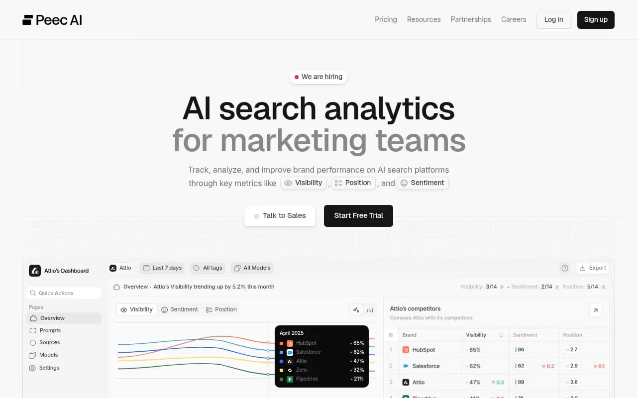
IP-verified AI crawler logs, page-level search data overlaid with AI citations, and weekly site audits are what turn "we are invisible" into "here is the specific reason." Promptwatch includes these alongside its tracking, and it also pulls in Google Search Console and Bing Webmaster data per page. Several monitoring-first tools in the catalog, such as Otterly.AI and Peec AI, concentrate on the measuring end.
Otterly.AI

Problem 5: too many prompts, too little structure
Prompt tracking has a UX problem of its own. Teams paste in 200 prompts, get 200 rows, and then stare at them.
Good design adds structure so the list becomes a model of how customers actually ask:
- Topics and tags to group prompts, so you can see "we are strong on pricing questions and weak on integration questions."
- Prompt types (organic, brand-specific, competitor comparison), because they behave differently. Promptwatch's report shows brand-specific prompts cite fewer domains (21.3% cite 10+) than organic ones (52.5%).
- Personas, since the same question from a CFO and a developer should not produce the same answer.
- Volume and difficulty estimates, so you do not spend a month on prompts nobody asks.
- Query fan-outs, which show the actual web searches the AI ran behind the answer. This is the closest thing to seeing the model's homework.
Without these, you cannot prioritize. And a tool that cannot help you prioritize is exactly one that feels hard.
What good design looks like: a checklist
Putting the problems together, here is what I would want from a GEO tool in 2026.
It explains every number
Click any metric and see the underlying prompts, responses, models, countries and dates. If a score cannot be traced to raw responses, do not trust it.
It shows its settings
Surface queried, country, language, brand aliases, how a mention is defined. These should be editable and visible, not buried.
It handles change
Chart annotations for platform shifts, period-over-period comparison, and alerts. Weekly digests that say what changed, not just what exists.
It tells you what to do next
A prioritized action list with evidence behind each item beats a wall of widgets. Even better if it is assignable to teammates and its status is tracked.
It can answer questions in plain language
Building a custom report for each question is slow. A chat interface over your live data (prompts, citations, crawler logs, traffic) lets a marketer ask "which competitors beat us on pricing prompts in Germany?" and get a chart. Promptwatch's Agent Chat does this, and several others are adding similar assistants.
It connects to where work happens
Slack briefings, CMS publishing, an API or MCP server, and exports to Looker Studio or CSV. If everything has to be copied out of the tool by hand, the tool becomes a chore.
It closes the loop
When you publish a page, the tool should tell you whether it was crawled, cited and clicked, and send underperformers back as actions. This is the difference between an optimization platform and a tracker.
How popular options fit this lens
The table below is a fast orientation, not a verdict. Features change quickly, so confirm details on each vendor's site.
| Tool | Where it is strongest | Where it tends to stop |
|---|---|---|
| Promptwatch | Full loop: real-UI tracking, crawler logs, visitor analytics, content gap analysis, Content Agent with CMS publishing, Action Board | Larger feature surface to learn than a simple tracker |
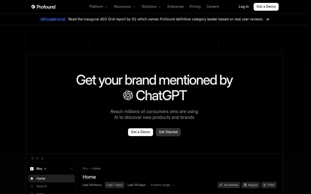
| Profound | Enterprise monitoring depth | Higher price point, less on execution |
| Otterly.AI | Quick, affordable monitoring | Limited diagnosis and content tooling |
| Peec AI | Clean tracking for marketing teams | Mostly measurement |
| Semrush AI features | Convenient if you already use Semrush | Shallower GEO-specific depth |
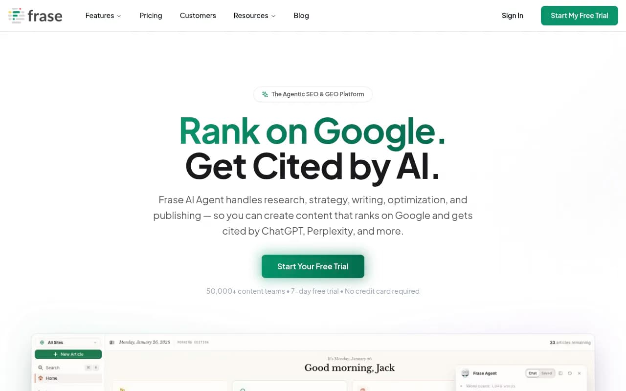
| Frase | Content research and writing tied to GEO scoring | Narrower on crawler and traffic diagnostics |
Profound
One honest note on Promptwatch: because it covers the full stack, it has more surface area than a pure tracker. The Action Board and Agent Chat exist partly to keep that from feeling heavy, by telling you where to look first. If you only need a weekly mention count, a lighter tool is fine. If you want to know why and fix it, the extra depth is the point.
For a broader scan of what exists, the GEO software directory at bestgeosoftware.com lists many of these side by side.
How to test a tool in a week
Feature lists do not reveal usability. A real task does. Here is a simple trial plan.
- Pick 20 to 30 prompts that match how real buyers ask about your category. Include brand-specific and competitor comparison prompts.
- Run the same set in two tools and compare. Note where they disagree, and check whether each tool lets you see why.
- Choose one page you care about and try to find out why it is or is not cited. Time yourself.
- Ask the tool for a next action. Is it specific ("rewrite this section to answer this prompt") or generic ("add more content")?
- If it supports publishing, push one piece through the workflow and see how many clicks and tools it takes.
- After a few days, check whether it tells you what happened to that page.
If any step sends you to a spreadsheet, note it. That is where the tool is not carrying its weight.
A note on trust and the design of numbers
The Genezio piece makes one good argument that holds regardless of who is selling: small samples and point estimates are weak evidence. AI answers fluctuate, so a number from 20 prompts on one day is noisy. Better tools run prompts daily, aggregate across many, and show ranges or trends instead of overconfident single values. When a vendor shows "73%" with no context, ask how many samples are behind it.
The Frase guide cites a SparkToro figure that 68% of U.S. Google searches ended without a click between January and April 2026. I could not verify that independently, so treat it as a vendor-cited claim. The direction, that more answers end on the results page or in the AI answer, is plausible and is why this tooling matters at all.
Where this leaves you
Most GEO tools feel hard because they were built to measure, not to help you decide. The fix is not a prettier chart. It is a tool that explains its numbers, shows its settings, flags platform changes, and connects insight to a published, tracked result.
Pick the one that finishes the most of your actual weekly loop, then run the one-week test above before you sign anything. For other tool categories, the directory at surferstack.com is a good place to keep browsing, and Promptwatch's data hub is worth a look if you want to see how AI citation behavior has been shifting through 2026.