Kepler.gl Review 2026
Uber-developed tool for exploring and visualizing massive geographic datasets directly in your browser. Powerful for data scientists working with location data.
Key Takeaways:
- Free & open source WebGL-powered geospatial visualization tool originally developed by Uber, now maintained by the OpenJS Foundation
- Handles massive datasets with millions of points rendered smoothly in-browser using Deck.gl and GPU acceleration
- Rich layer types including points, arcs, hexbins, heatmaps, GeoJSON polygons, and 3D buildings with time-based animation
- Embeddable React component that developers can integrate into custom applications via npm package
- Best for: Data scientists analyzing location data, urban planners visualizing movement patterns, researchers exploring spatial datasets, developers building custom geospatial apps
- Limitations: Browser memory constraints for extremely large files, no built-in collaboration features, requires technical knowledge for advanced customization
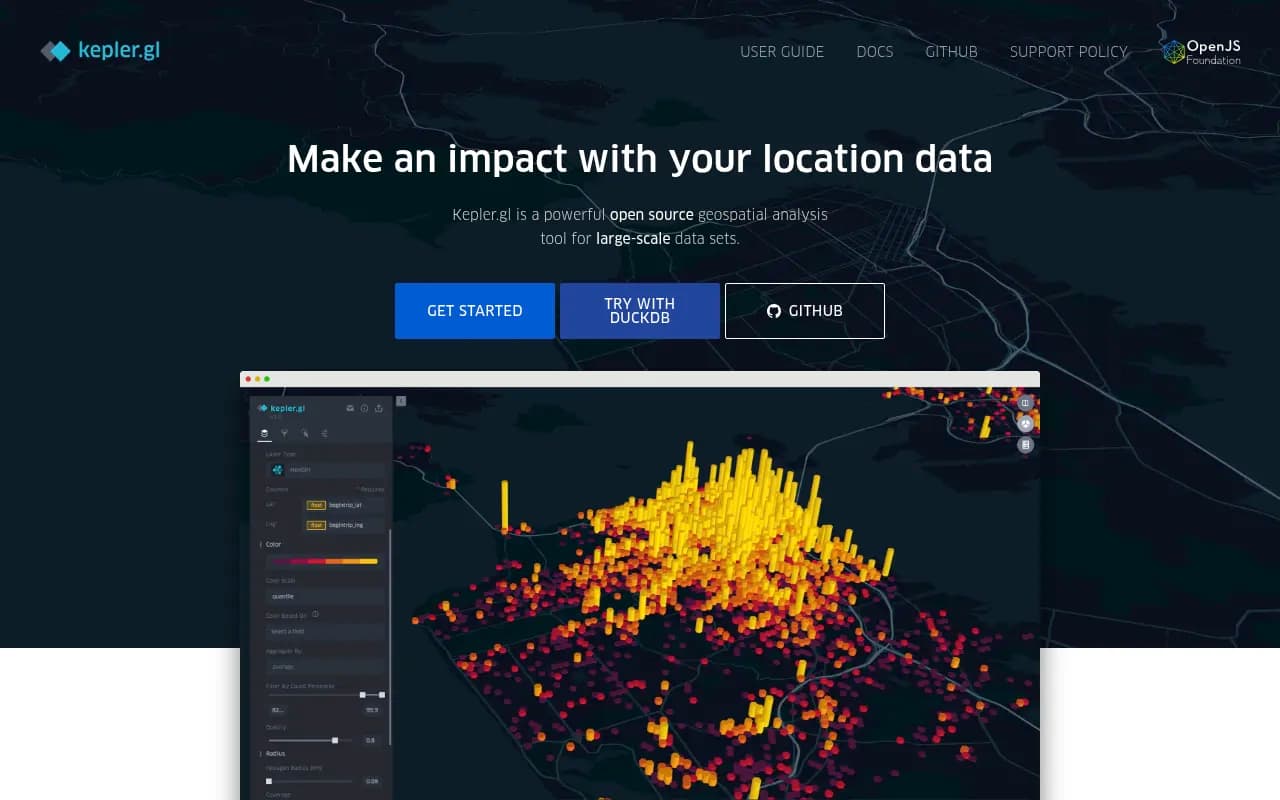
Kepler.gl is an open-source geospatial visualization platform that emerged from Uber's data visualization team in 2018 and has since become one of the most powerful browser-based tools for exploring large-scale location datasets. Unlike traditional GIS software that requires desktop installation and steep learning curves, Kepler.gl runs entirely in your browser and lets you drag-and-drop CSV, GeoJSON, or other spatial files to instantly create interactive maps with millions of data points.
The tool is built on Deck.gl (Uber's WebGL-powered visualization framework) and React/Redux, which means it leverages your GPU to render datasets that would choke most web-based mapping tools. You can visualize taxi trip records, earthquake data, population density, street trees, commute patterns, or any dataset with latitude/longitude coordinates — and apply filters, aggregations, and time-based animations without writing a single line of code.
Kepler.gl is now part of the OpenJS Foundation and has an active community of contributors. It's used by data scientists at companies like Foursquare (which built a desktop app on top of it), urban planning departments, academic researchers, and developers who embed it into custom dashboards.
Layer Types and Visualization Capabilities
Kepler.gl supports seven core layer types, each optimized for different geospatial use cases:
-
Point layers: Render individual locations with customizable size, color, and opacity based on data attributes. Supports millions of points with smooth pan/zoom. You can map each point's visual properties to dataset columns (e.g. color by category, size by magnitude).
-
Arc layers: Visualize origin-destination flows with curved 3D arcs. Perfect for commute patterns, flight routes, migration data, or any dataset with start/end coordinates. The arc height and color can be mapped to attributes like trip volume or distance.
-
Line layers: Connect sequential GPS coordinates to show paths, routes, or trajectories. Useful for vehicle tracking, animal movement studies, or street network analysis.
-
Hexbin aggregation: Automatically bins point data into hexagonal grids and aggregates values (count, sum, average) within each cell. Great for density mapping and spatial pattern detection. You control the hexagon size and aggregation method.
-
Heatmaps: Kernel density estimation that creates smooth gradient visualizations showing concentration of points. Adjustable radius and intensity settings let you fine-tune the visual effect.
-
GeoJSON/Polygon layers: Render administrative boundaries, building footprints, census tracts, or any polygon geometries. Supports choropleth mapping where polygon fill color represents data values (e.g. unemployment rate by county). Can also extrude polygons into 3D buildings based on height attributes.
-
Cluster layers: Automatically groups nearby points into clusters with counts, reducing visual clutter for dense datasets.
All layers support time-based animation via a built-in playback control. If your dataset has timestamp columns, you can animate how patterns evolve over time — watching earthquake sequences unfold, traffic patterns shift throughout the day, or population movements across years.
Data Import and Format Support
Kepler.gl accepts multiple geospatial data formats via simple drag-and-drop:
- CSV files with latitude/longitude columns
- GeoJSON and TopoJSON
- KML (Google Earth format)
- Shapefile (zipped)
- WKT (Well-Known Text)
- GPX (GPS tracks)
- Arrow and Parquet files
- PMTiles (cloud-optimized tile format)
- Mapbox Vector Tiles (MVT)
The tool auto-detects coordinate columns and suggests appropriate layer types based on your data structure. For large files (100MB+), browser memory becomes the limiting factor — this is where Foursquare's Spatial Desktop app (a native desktop version built on Kepler.gl and DuckDB) removes browser constraints and handles multi-GB datasets.
You can load multiple datasets simultaneously and create layers from each, enabling comparative analysis. The interface also supports brushing — selecting points on one layer highlights corresponding data on other layers, useful for exploring correlations between datasets.
Filtering and Interaction
Kepler.gl's filtering system is one of its standout features:
- Range filters: Slider controls for numeric columns (e.g. show only earthquakes above magnitude 5.0)
- Time filters: Scrub through temporal data with a timeline control, or set specific date ranges
- Categorical filters: Multi-select dropdowns for text/category columns
- Polygon filters: Draw custom shapes on the map to filter data spatially
Filters update the visualization in real-time, and you can stack multiple filters to drill down into specific subsets. The time playback feature animates filtered data over time, with adjustable playback speed and looping.
The map itself supports standard interactions: pan, zoom, rotate, tilt (for 3D views). You can switch between multiple base map styles (dark, light, satellite, streets) and toggle layer visibility. Tooltips appear on hover showing data attributes for individual features.
Customization and Styling
Each layer offers extensive styling controls:
- Color scales: Choose from preset color ramps or define custom gradients. Map colors to data columns using quantile, quantize, or ordinal scales.
- Size/height scaling: Make point radius or polygon extrusion height proportional to data values
- Opacity and blending: Control transparency and how layers composite over each other
- Stroke and fill: Separate controls for polygon borders vs interiors
- Label layers: Add text labels to features with customizable fonts and positioning
The interface provides a live preview as you adjust settings, so you can iterate quickly on visual design. You can also apply aggregation functions (count, sum, average, min, max) when using hexbin or grid layers.
Embedding and Developer Integration
Kepler.gl is designed to be embedded into custom applications. The core library is available as an npm package (kepler.gl) and integrates with React/Redux applications. Developers can:
- Embed the full Kepler.gl UI as a React component
- Use the underlying Deck.gl layers directly for more control
- Programmatically load data, apply filters, and configure layers via the Redux store
- Export map configurations as JSON and reload them later
- Customize the UI by hiding panels or adding custom controls
The GitHub repository includes detailed API documentation and examples. The codebase is modular, so you can import only the pieces you need rather than the entire application.
There are also official bindings for:
- Jupyter notebooks: Render Kepler.gl maps inline in Python notebooks, useful for data science workflows
- Tableau: Embed Kepler.gl visualizations in Tableau dashboards
- VS Code: A Geo Data Viewer extension that uses Kepler.gl to visualize spatial files directly in the editor
These integrations make Kepler.gl accessible to non-developers who work in these environments.
Foursquare Spatial Desktop
Foursquare (a major contributor to Kepler.gl) built Spatial Desktop, a native desktop application that extends Kepler.gl with:
- DuckDB integration: Run SQL queries on multi-GB datasets without browser memory limits. Perform spatial joins, aggregations, and transformations using SQL.
- Cloud-native formats: Native support for GeoParquet and PMTiles, enabling efficient access to massive cloud-hosted datasets.
- SQLRooms foundation: A plugin architecture for extending functionality with custom spatial operations.
- Local and cloud storage: Save projects to your desktop or personal cloud storage (Dropbox, Google Drive).
Spatial Desktop is essentially Kepler.gl without browser constraints, aimed at GIS professionals and data engineers who need to process large spatial datasets. It's a separate product from the open-source Kepler.gl but shares the same visualization engine.
Who Is Kepler.gl For
Kepler.gl is best suited for:
-
Data scientists and analysts exploring spatial patterns in research datasets (epidemiology, climate science, social science). If you're working with CSV exports from databases or APIs and need to quickly visualize geographic distributions, Kepler.gl is faster than setting up QGIS or ArcGIS.
-
Urban planners and transportation analysts visualizing movement data, traffic patterns, public transit usage, or demographic trends. The arc and hexbin layers are particularly useful for origin-destination analysis.
-
Developers building geospatial dashboards who want a pre-built, high-performance visualization component rather than building from scratch with Leaflet or Mapbox GL. The React/Redux architecture makes it straightforward to integrate.
-
Journalists and storytellers creating data-driven map visualizations for articles or presentations. The export-to-image feature and shareable demo links make it easy to publish.
-
Researchers with large point datasets (GPS tracks, sensor networks, ecological observations) who need to visualize millions of records without desktop GIS software.
Kepler.gl is not ideal for:
-
Non-technical users who need a simple point-and-click map maker. The interface assumes familiarity with geospatial concepts (projections, coordinate systems, layer types). Tools like Google My Maps or Mapbox Studio are more beginner-friendly.
-
Teams needing collaboration features. Kepler.gl is a single-user tool with no built-in sharing, commenting, or version control. You export JSON configs and share them manually.
-
Production mapping applications requiring custom branding, authentication, or backend integration. While embeddable, Kepler.gl is primarily a visualization tool, not a full mapping platform.
-
Users working with extremely large datasets (10GB+) in the browser. Browser memory limits will cause crashes. Spatial Desktop or a backend solution (PostGIS + custom frontend) is better for this scale.
Pricing and Licensing
Kepler.gl is completely free and open source under the MIT license. There are no usage limits, no paid tiers, no watermarks. You can use it for commercial projects, modify the source code, and redistribute it.
The hosted demo at kepler.gl/demo is free to use but doesn't save your work — you export map configs as JSON files and reload them later. If you want persistent storage, you either embed Kepler.gl in your own app with a backend, or use Foursquare Spatial Desktop (which is a separate paid product, though pricing isn't publicly listed).
Strengths
-
Performance: WebGL rendering handles millions of points smoothly, far exceeding most web-based mapping tools. The hexbin and aggregation layers are particularly fast.
-
Rich layer types: The variety of visualization options (arcs, hexbins, 3D extrusions, time animation) covers most geospatial use cases without needing multiple tools.
-
Open source and embeddable: Full control over the codebase, active community, and straightforward integration into custom apps.
-
No setup required: The hosted demo works instantly — drag a file, get a map. No account creation, no installation.
-
Time-based animation: The playback controls for temporal data are intuitive and powerful, great for storytelling.
Limitations
-
Browser memory constraints: Large files (500MB+) can crash the browser. Desktop GIS tools or Spatial Desktop handle bigger datasets more reliably.
-
No collaboration or cloud storage: You can't share maps with teammates or save projects to the cloud without building your own backend. It's a single-user, local-first tool.
-
Steep learning curve for non-GIS users: The interface assumes you understand geospatial concepts. Beginners may struggle with layer configuration and coordinate systems.
-
Limited cartographic control: Compared to QGIS or ArcGIS, you have fewer options for label placement, symbology, and print-quality output. It's optimized for interactive exploration, not publication-ready maps.
Bottom Line
Kepler.gl is the best free, open-source tool for visualizing large geospatial datasets in a browser. If you're a data scientist, urban planner, or developer who needs to quickly explore and share location data — and you're comfortable with some technical setup — Kepler.gl delivers performance and flexibility that rivals desktop GIS software. The ability to handle millions of points with smooth animations and rich layer types makes it a standout choice for spatial data exploration. For teams needing collaboration or users working with 10GB+ datasets, consider Foursquare Spatial Desktop or a backend solution, but for most use cases, the free hosted version or embedded component is more than sufficient.
Frequently asked questions
What is Kepler.gl?
Is Kepler.gl free to use?
What types of data can I visualize with Kepler.gl?
How much data can Kepler.gl handle?
Who should use Kepler.gl?
Can I embed Kepler.gl in my own application?
What are the limitations of Kepler.gl?
Does Kepler.gl require coding knowledge?
What visualization types does Kepler.gl support?
Similar and alternative tools to Kepler.gl